How confident are YOU in your Email Design?
Did you know that every email you send will drive sales and awareness for your company?
In our free webinar, Design your Email Template in 15 minutes or less, we’ll show how to do it. You can’t attend the live webinar? Register anyway, and we will email you the recording.
Learn how to create a mobile responsive email template which matches your brand and communicates your message clearly. This will help you drive action for your company.
You want to start right away?
Download the Email Design Checklist. Follow the steps.
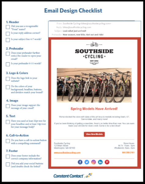
1. Header
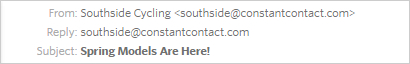
It’s like an envelope. Although it isn’t something that you would think of as being a design feature, it is the first thing readers will see when they open their email. Like a postal piece, the sender of an email can influence your decision to open.
Use a “From name” that will be recognized by your contacts and associated with your company.
A subject line that is eye-catching will also help readers decide if they want to read the email. You’ll need to keep in mind that over half of all emails are opened on mobile devices. To make the best use of the limited mobile inbox space, write 4-7 words.
11 secrets for creating standout subject lines.
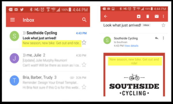
2. Preheader
Use the preheader to entice recipients to open your message. Use the first 6 to 11 words.
This is how the preheader appears in a mobile subscriber’s inbox:
3. Logo and colors
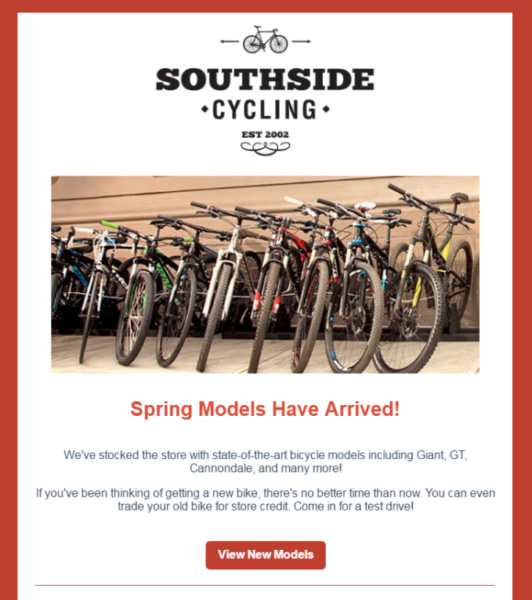
Your logo and colors will be the first thing that people notice when they open your email.
Consistently use these elements to make your email contacts recognize your brand. They’ll start to recognize your emails in their inbox, and be more inclined to open them.
Tip : Use your logo and colors in your email to make it look professional .
4. Image

Use an image to support the message you are sending. Use an image to illustrate your message if you are sending out a message about the sale of a certain product.
You can edit your photos online for free to make them look more professional .
5. Text
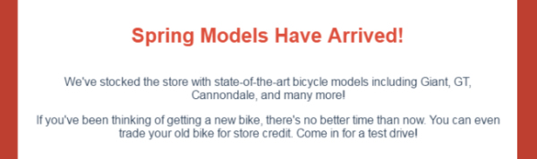
People scan content on mobile devices or online before reading it.
Your text should be designed in a manner that grabs the attention of your reader. Use a 22pt font size for your headings, and a complementary colour that matches your brand colours.
The body of the message should be a minimum size 14pt and should contain at least 3-5 sentences explaining why people should click on your call-to action button.
What to write when you’re not sure? If you don’t know what to write, here are 30 ideas.
6. Call-to-action

Tell your readers what to do next. You might want to tell your readers that they should visit a certain page on your site, call your shop, or redeem an coupon.
Make your call to action easy to click by using a button.
7. Footer
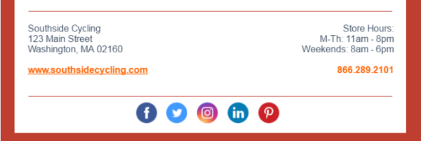
Your email footer will always be the same, and it contains all of your important contact details.
Include your website address, telephone number, and operating hours in the footer.
Include links to your social media channels so that people can connect with you via the social network of their choice. Test those links before sending your email.
Send emails with confidence
Download your Email Design Checklist or bookmark it so that you can ensure every email is designed for success.